
Holland America Line
We care for the well-being of each other, our guests, and the planet. We strive to do the right thing, always. We go the extra mile to assist guests and team members, and recognize that every interaction is important, no matter how big or small.

My Role
UX/UI Designer
UX Researcher

Tools Used
Adobe XD
Figma
UserZoom
Microsoft Teams
Slack
A secondary flow redesign for

My Key Contributions
Designed 30+ pages (mobile/tablet views were also designed for these pages)
Created many complex prototypes in Figma
Moved existing Adobe XD files to Figma
Assisted in writing and conducting user tests

Team Players
4 UX/UI Designers
2 Project Managers
1 Director
1 Ecommerce strategist

Duration
Around 3 Months
May - August 2022
Note for readers
This was a massive, multi-month project where I was involved in many different tasks and mini-projects. I have put only the main points of this project that either I myself worked on, or had a direct effect on my work. As I’m typing this in 2023, this was (and still is) an ongoing project for Holland America Line.

The Problem
Guests using the Holland America Line site should be able to load the site in a timely manor, and be able to navigate the site with relative ease. In it’s current state, load times are very long, and guests are having many difficulties navigating through their experience.

Website before redesign

Mobile view

Using UX Research to push the project forward
The average Holland America Line guest is 57 years old. There was a lot of user feedback surrounding the difficulty of finding certain items, or even thinking they had found other items, only for the icon to be non-clickable.
Heatmap Insights

Here users are clicking on the stateroom photo, map image, and ship image. These fields were not actually clickable.

Few users clicked on the highlighted shore excursions on the homepage. The cards shown do a poor job of indicating that they are clickable. Instead it just looks like you can either keep scrolling, or add it to the cart.

Pre and post cruise are hardly utilized at all.
Secondary Research and Competitive Inspiration
Throughout the process of the redesign, our team visited several other cruise line sites, as well as e-commerce sites looking for inspiration. REI, Carnival Cruise, Princess, Nike, and Royal Caribbean were a few of the sites the team used frequently.

Transferring an Adobe XD project to Figma
The first week I was on this project, I worked with the team to transfer around 2 dozen or so existing screens from Adobe XD to Figma. From here we were able to create the tablet and mobile views for these screens.

Designing a responsive header prototype
After the initial move over from Figma, I was tasked with creating a responsive prototype for the header section. This prototype was to include web view, tablet view, and mobile view.
Web view of the prototype

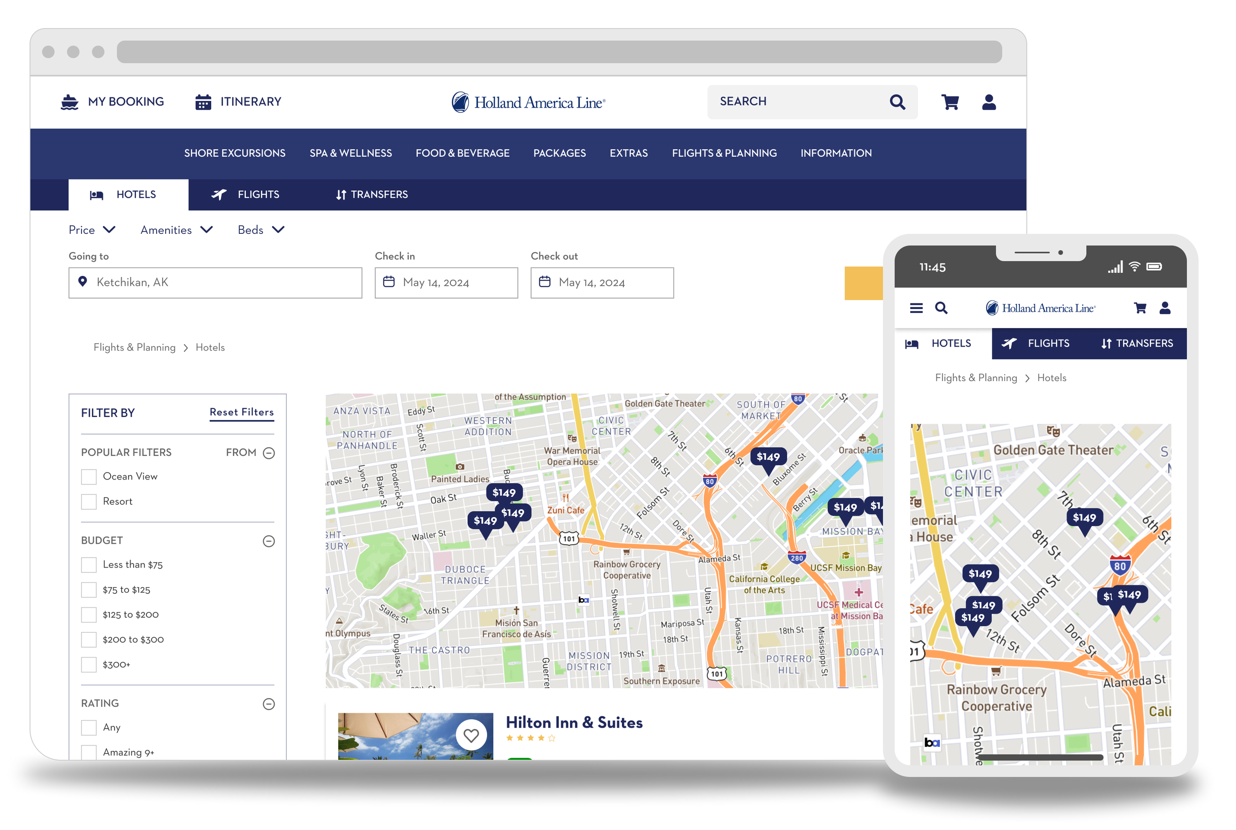
The design process behind the transfers pages
I was given the incredible opportunity to design this page almost from scratch. I wanted to make sure that I fully understood the assignment, as the page from the previous site was very ambiguous.
Business objective:
Create a page where guest can enter their cruise information and get information about how they can get to and from their cruise liner. These include:
Taxis or shuttles to/from the destination
Public transport
Details about the method of transportation
1. Empathize

I spoke with a few friends and family members about the current experience of the transfers page. With only a ticket as a guide, it was generally agreed on that some visual representation would make it much easier to navigate and use this service.
2. Define

After better understanding the mindset of a user, I was able to further specify my design requirements.
New requirements:
A map to visualize the route to be travelled
A detailed step-by-step guide
3. Ideate

After looking into many different services and playing with, I decided to model my design after Google maps.

Google maps navigation service for walking
4. Design

After looking into many different services and playing with, I decided to model my design after Google maps.
Transfer search page
Transfers detail page
Google had a very user-friendly that would assist in accomplishing what I had set out to design. For that reason, I allowed maps to influence my own designs. Something else to consider is that Google maps has an API that could potentially be used here.
Bullet points
Google maps offers an API that would make developing this much easier
This was designed so that users would have multiple reference points to look at, so that navigation becomes much easier of a task

User Research surrounding the Shore Excursions pages
After weeks of redesign, we were finally ready to put designs in front of users. I assisted in writing the test (I’d like to credit Johnny Lau and Cathrine Conoley with the majority of the writing and the final edits). Each designer on the team was given the assignment to conduct a moderated usability study on 2 participants.
Who

During these tests, our target users were mid-aged individuals that had either been on cruises, or would be interested in going on a cruise in the future.
What
During this these tests, our goals where to test the following:
Where would the guests go to find their past purchases?
Where would guests go to see where a specific item was for a specific day?
What questions do the participants have about the experience?
How was their experience?
How did this stack up to other similar sites in their opinions?
Would they change anything?
How would guests find shore activities after booking a cruise?
How would they find port activities for a certain day?
How would they find excursions for a specific day (May 18th in the example used)?
If they were not ready to purchase, how would they go about saving the selection?
How would they purchase a specific excursion (adventure kart was used in the test)?
How does this experience compare to experiences with online purchasing?
When & How
On the week of July 11th, we conducted these moderated usability studies.
8 total Participants

The tests where designed to take around 1 hour for each participant.
The interviews were recorded with consent. The data was then extracted and exported to a single spreadsheet for analysis.

Data Analysis & Synthesis
There were absolutely things to be improved upon, however the tests had shown promising results. The project was able to continue forward with these results. Below are some the things that either were improved upon, or can be in the future.
3 of the 8 individuals either did not notice this selector, or had difficulty understanding it at first.
Shown here, a very large notice was added to make this feature more obvious to users.

2 of the 8 individuals did not add their shown family member during this portion of the test.
Imagine booking an amazing night out with a loved one, only to realize that you forgot to add them.

During testing

My proposed solution
2 of the 8 individuals did not open the user drawer.
My suggestion to combat this was adding a very short onboarding flow to show and tell users how to better interact with the site.

Conclusion
After some final edits, and a few more micro projects, this contract successfully came to a close. I am truly grateful to have been given this incredible opportunity to work on such a massive project with some incredible individuals.
What did I learn?
This project taught me how to interpret and synthesize data better, to use new technologies (UserZoom, Asana, and others), and showed me what it is like to be a team player. Going from small projects to a massive project like this was challenging, but if it wasn’t, I don’t think I would have learned near as much.
What would I have done differently?
There is always room to grow as a designer. If I had the chance to do this over again, I think that I would like to have separated smaller tasks out into their own projects better. I have since adapted this into my regular workflow. Looking at each new task as an opportunity to work on your personal system of tackling projects pays exponential dividends.
Let’s get in touch!
Do you have a UX Designer shaped hole in your organization? I’m always open to discussing strategic partnerships and contract needs, so please don’t hesitate to reach out.